The 3.7% That Looked Like 50%
On November 24, 2025, Anthropic released Claude Opus 4.5. The announcement chart showed Opus 4.5 towering over Sonnet 4.5. However, the Y-axis started at 70%, exaggerating a modest 3.7% performance gap into what looked like a 50% dominance.
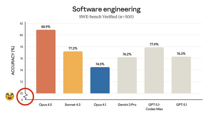
Chart source: Anthropic Official X Account via Maziyar Panahi
The Violation
- 1
Y-axis truncated at 70% instead of starting at 0%
- 2
3.7% actual difference (80.9% vs 77.2%) appears as ~50% visual difference in bar heights
- 3
Classic data visualization manipulation to exaggerate marginal improvements
- 4
Community immediately called it out within hours of posting
Why This Matters
When you're showing competitive performance between your own models, starting at 70% transforms a modest improvement into what looks like a revolutionary leap. The 6.4-point gap between Opus 4.5 and Opus 4.1 looks like Opus 4.5 is three times better, when it's actually 8.6% better.
Community Verdict
"what?"
"The actual difference is 3.7%, but the bar looks twice as big. This is textbook truncation."
Spot a similar crime?
Help us document chart crimes in the wild